What is Data Visualization
In the big data era, data is emerging from everywhere and new technologies allows us to gather more and more data. In general, big volume of data in its raw state are useless, to get the best of it, data must be processed to extract patterns and KPI.
But even after extracting KPI, a user still need to make a lot of efforts to get something from it, specially user with no technical background. So to make our data useful we must make it tell a story, a story every human can understand.
Why Data Visualization:
The human brain is already used to deal with shapes, colors, size, position… this is part of our everyday life, so why complicating it using something else.
There is where data visualization techniques take place, associating KPI to visual context like colors, shapes, position…
Benefit of using Data Visualization:
As already stated associating data to visual context help us communicate a big amount of data at one shot. So instead of reading large text a user can see a single page data visualization.
Examples:
Europe's migration crisis :
You can see at a single glance that in Europe, the country that receive the most immigrants is Germany, the most of them are Syrians, translating this DataViz to a text or table will be more time consuming to read and understand.
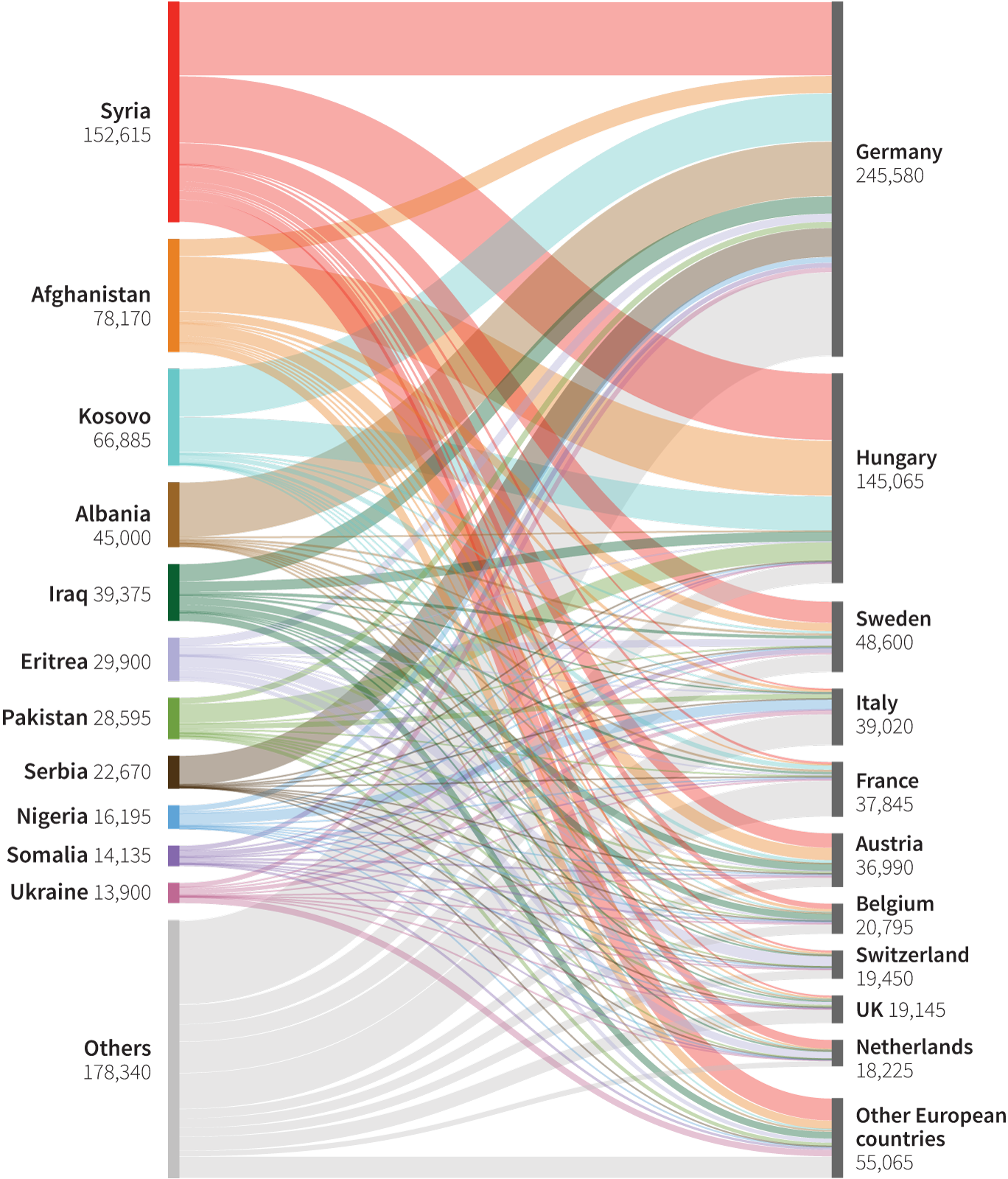
In this DataViz the visual properties used are:
- Thickness of the link between two countries to show the amount of immigrants fleeing their country to others hosts countries.
- The size of the barre next to the country name, to show how much a country send or receive immigrants.
- Colors to distinguish countries and link between them.
More wildfires than ever :
The same can apply on this DataViz done by FlowingData, at first glance we can understand that wildfire are more likely to happened at summer, and that their number and size is increasing along times.

In this DataViz the visual properties used are:
- Position can indicate the month and the year when the wildfire happened.
- Size of the circles representing the size of the fire.
Prayer time change :
And as a last example, here is an interactive DataViz I made to show the change of the daytime and nighttime along a chosen year and city.

You can find the interactive version on this link:
Prayer time during a year